网站导航   4000-006-150  
小站教育
2024年1-4月雅思口语题库
学生选择在小站备考:30天 524735名,今日申请2318人    备考咨询 >>
已发布
2019-04-25小站雅思A类写作考前预测预测

2019年4月25日雅思写作重点预测

更新时间:2019-04-15 11:53          

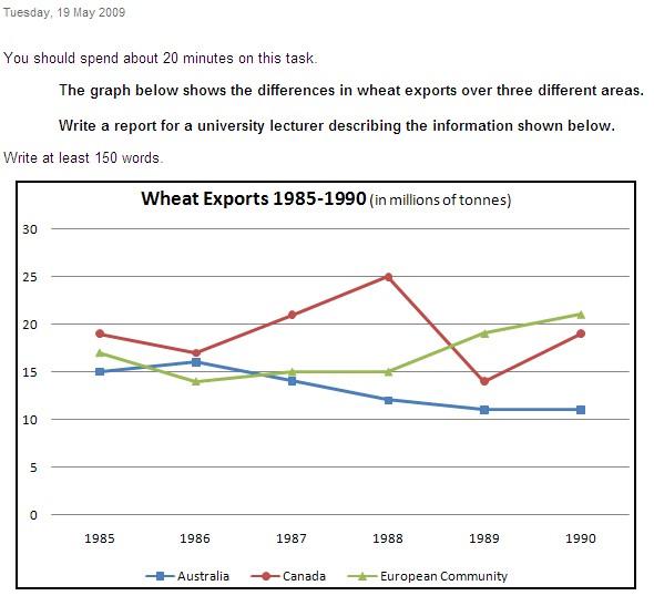
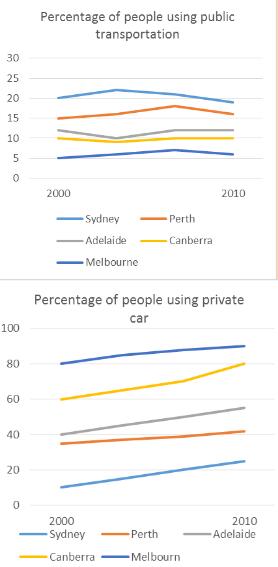
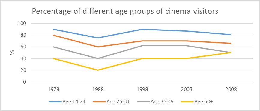
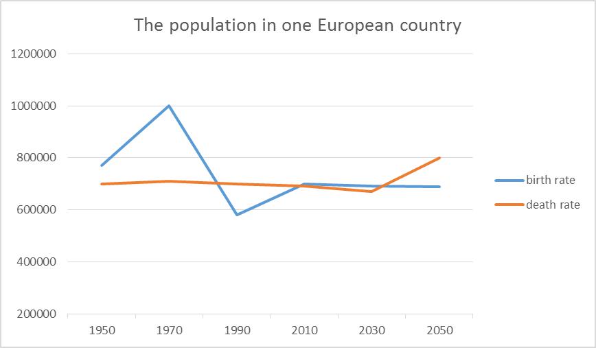
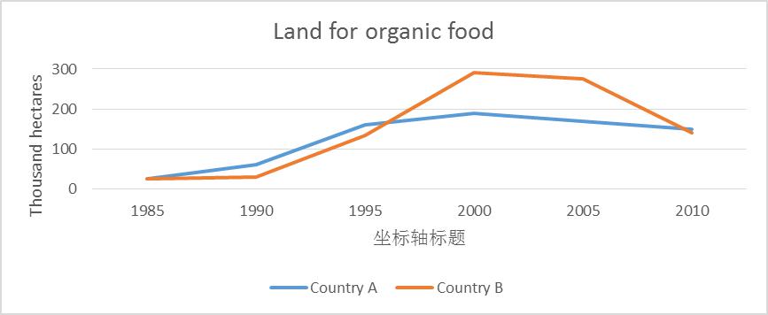
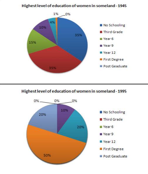
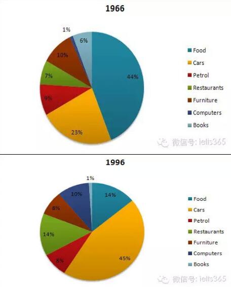
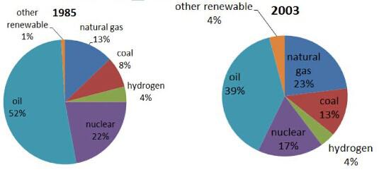
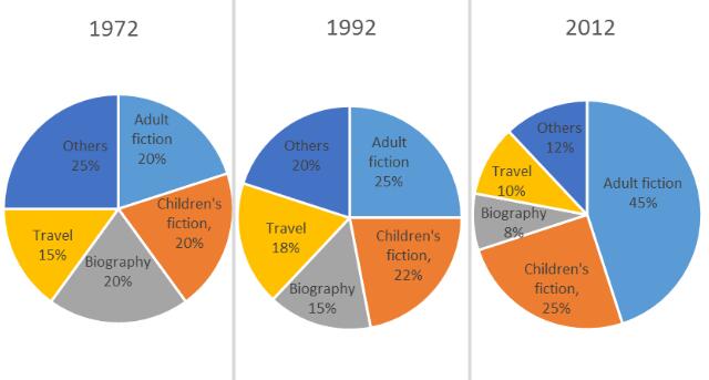
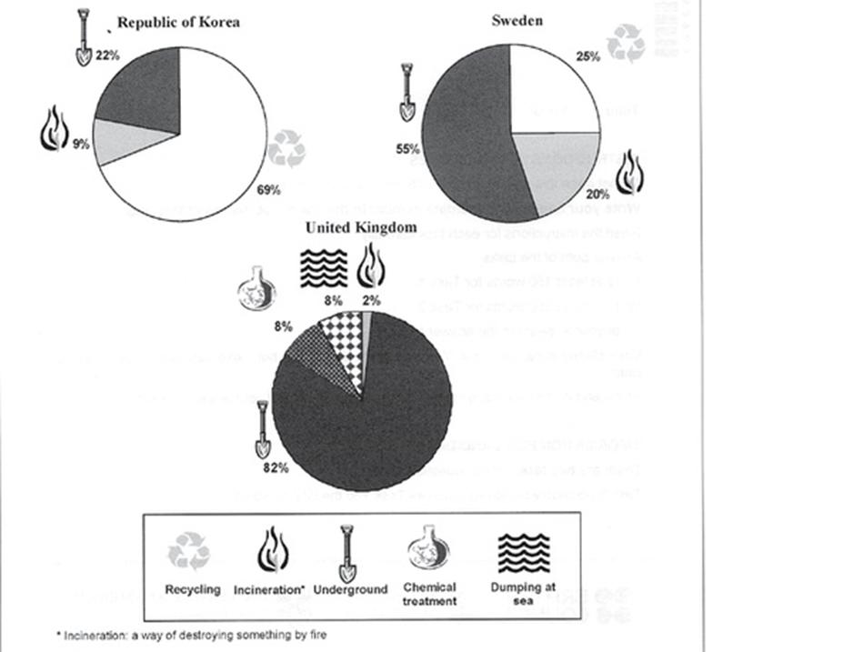
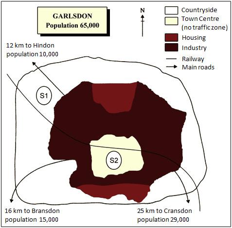
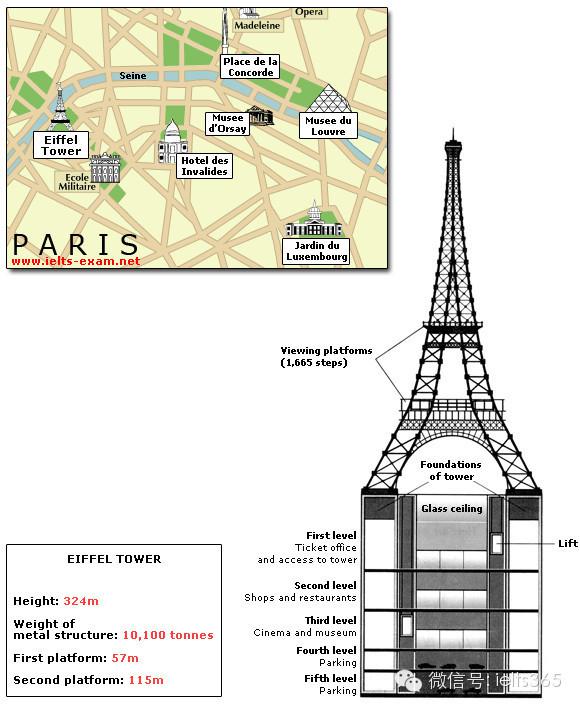
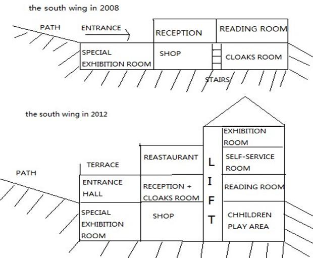
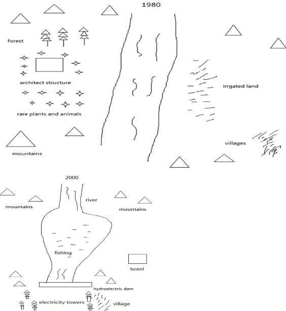
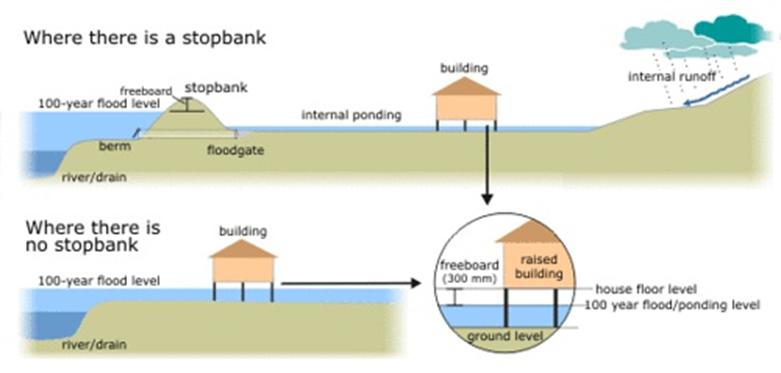
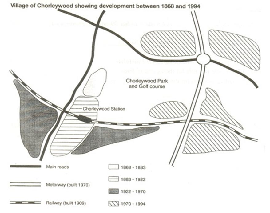
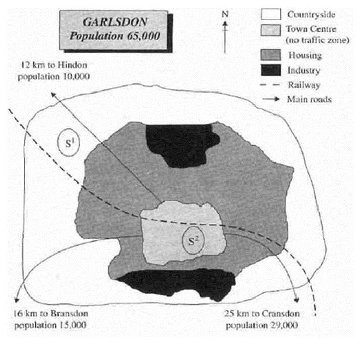
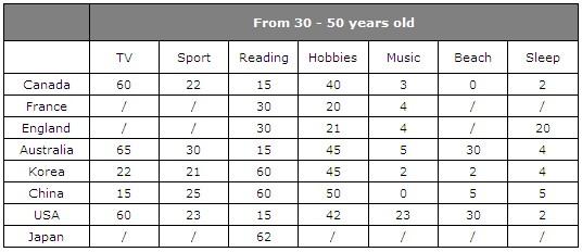
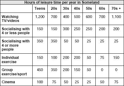
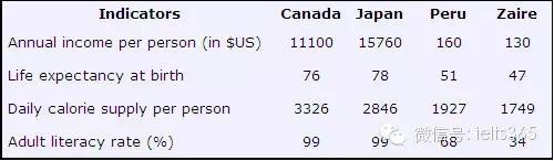
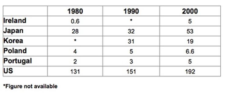
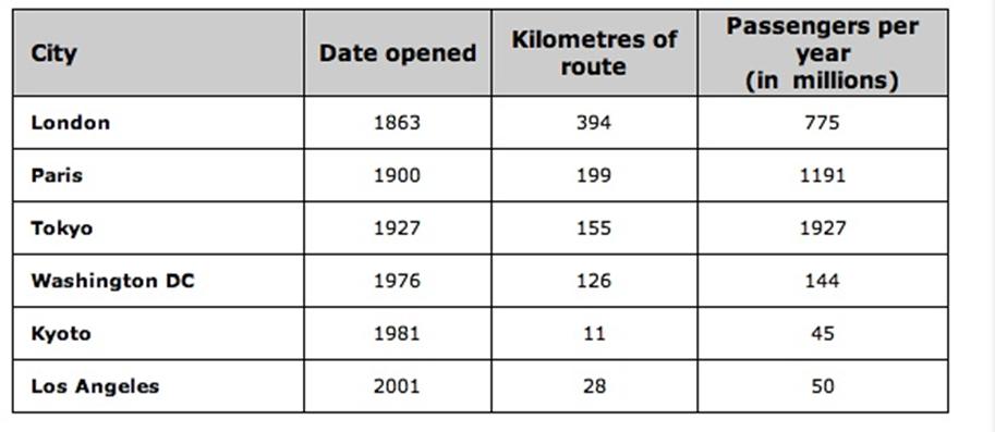
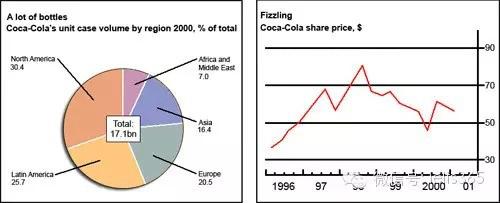
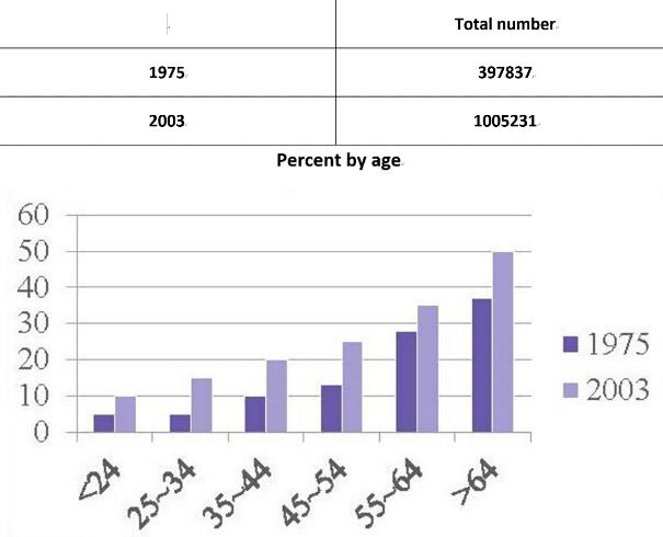
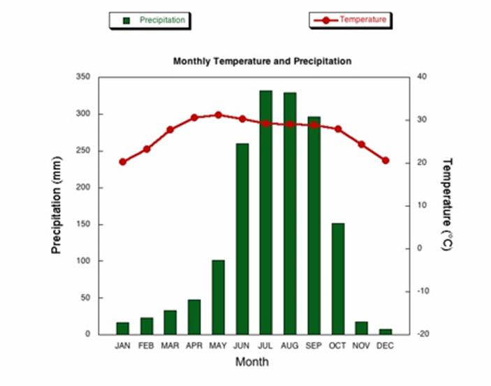
摘要:为大家带来2019年4月25日的雅思写作考前预测重点预测。通过对2018年的雅思写作的分析,雅思写作考试中出现旧题的几率很高,建议各位考鸭按照不同的写作话题重点复习2015-2017年的写作真题。小作文重点复习图表类题型,大作文重点复习话题:社会类,教育类及文化类写作真题。

订阅:0
下载:379
浏览:7025
立即下载完整考前预测
手机打开
手机打开的二维码 扫一扫手机打开

4月25日考前预测

4月25日考试说明

雅思写作考试时间总计1小时,要求完成一篇小作文一篇大作文。时间紧任务重,建议考生考前1个月重点复习雅思写作,可参考雅思写作机经中不同的写作话题和题型,每天练习一篇小作文,一篇大作文,并找专业的老师进行写作批改指导。没有写作思路的考生可查找写作参考范文。
4月25日雅思写作A

题型1 话题分类:线状图 属性:一级重点

参考题目1
The graph below shows the differences in wheat exports over three different areas. Write a report for a university lecturer descri...
The graph below shows the differences in wheat exports over three different areas. Write a report for a university lecturer describing the information shown below.
图片
解题思路
【首段】总述澳大利亚加拿大和欧盟小麦出口在1985年到1990年之间的变化 【二段】分述澳大利亚这段时间小麦出口的变化 【尾段】分述加拿大和欧盟这段时间小麦出口的变化
范文
The three graphs of wheat exports each show a quite different pattern between 1985 and 1990. Exports from Australia declined over the five-year period, while the Canadian market fluctuated considerably, and the European Community showed an increase. In 1985, Australia exported about 15 millions of tonnes of wheat and the
参考题目2
Eating sweet foods produces acid in the mouth, which can cause tooth decay. (High acid levels are measured by low pH values) Descr...
Eating sweet foods produces acid in the mouth, which can cause tooth decay. (High acid levels are measured by low pH values) Describe the information below and discuss the implications for dental health. You should write at least 150 words. Allow yourself 20 minutes for this task.
图片
解题思路
【首段】总述过多的糖会伤害牙齿,因为糖会使得pH值下降 【二段】甜食让pH值下降到5.5以下,时间越长越容易蛀牙 【三段】分述蔗糖最易引起蛀牙 【四段】分述果糖和蜂蜜对pH值的影响 【尾段】总述果糖和蜂蜜要比蔗糖好
范文
Anyone who has visited a dentist has been told that eating excessive amounts of sweets risks harming the teeth. This is because sweets lower pH levels in the mouth to dangerous levels. When the pH level in the mouth is kept above 5.5, acidity is such that teeth are unlikely to be in danger of decay. Sweet foods, however, cause pH in the mouth to drop for a time, and the longer pH levels remain below 5.5, the greater the opportunity for decay to occur.
参考题目3
The graph shows the spending on research into renewable energy of four countries from 1975 to 2000.
图片
解题思路
【首段】总述1975年到2000年四个国家在调研再生能源上的支出变化 【二段】分述在1975年和1980年四国各国支出 【三段】分述瑞士丹麦1985到2000年支出变化 【四段】分述西班牙英国1985到2000年支出变化 【尾段】总述投资最多的国家是瑞士,投资最少的国家是英国
范文
The line graph compares how much these four countries spent on the research of renewable energy during the period from 1975 to 2000. In 1975, there were no countries budgeting for this research, while the spending from Switzerland, Denmark, Spain and the UK reached 2.6, 1.8, 1 and 0.5 dollars per person respectively in the year 1980. In the
参考题目4
The line graph shows three different crimes in England and Wales in 1970-2005.
图片
解题思路
【首段】总述图表显示1970年到2005年英格兰和威尔士三种类型的犯罪数量 【二段】分述汽车偷盗在此期间的变化 【三段】分述入室盗窃和街头抢劫在此期间的变化 【尾段】总述在英格兰和威尔士汽车盗窃和入室盗窃是最多的犯罪种类,街头抢劫则是最少的犯罪种类
范文
The line graph compares the number of three different kinds of crimes in England and Wales during the period from 1970 to 2005. In 1970,the number of car theft was the highest (0.4 million), which was twice the figure for house burgling and nearly eight times the figure for street robbery. Then it increased quickly and reached
参考题目5
The line graphs show the percentage of people using public transport and people using private cars in five cities of Australia fro...
The line graphs show the percentage of people using public transport and people using private cars in five cities of Australia from 2000 to 2010.
图片
解题思路
【首段】总述图表显示2000年到2010年澳大利亚五个城市使用公交和私人轿车的比例变化 【二段】分述公交在五个城市使用比例的变化 【三段】分述私人轿车在五个城市使用比例的变化 【尾段】总述在澳大利亚私人轿车比公交更受欢迎
范文
The line graphs illustrate the changes of the percentage of the citizens using public transportation and using private cars in five different cities in Australia from 2000 to 2010. The percentage of those who use public transportation fluctuated in all cities during these ten years, among which the proportion of Sydney occupies the leading place. The second
参考题目6
The line graph shows the percentage of different age groups of cinema visitors in a particular country.
图片
解题思路
【首段】总述图表显示某个国家的四个年龄阶层从1978到2008年到影院看电影的比例变化 【二段】分述14-24,25-34以及35-49这三个年龄阶层到影院看电影的比例变化 【尾段】分述50岁以上老年人到影院看电影的比例变化
范文
The line graph reveals the proportion of people who go to the movies by four age groups in a particular nation from 1978 to 2008. During the thirty years, three age groups (14-24, 25-34 and 35-49) experienced a similar pattern. The young (age 14-24) enjoyed visiting cinema the most, reaching 90% in 1978, and then it declined slightly to 75% in 1988 and grew up again
参考题目7
The line graph shows the population in one European country.
图片
解题思路
【首段】总述图表显示某个欧洲国家从1950到2050出生率和死亡率的变化情况 【二段】分述这段时期这个国家的出生率的变化情况 【尾段】分述这段时期这个国家的死亡率变的化情况
范文
The line graph reveals both the birth rate and death rate in a European country during the year of 1950 to 2050. In 1950, the total number of people in this country was approximately 780,000, and after that it soared to nearly 1,000,000. However, after the peak in 1970, th
参考题目8
The line below shows the land used for organic crops in two countries between 1985 to 2010.
图片
解题思路
【首段】总述图表显示A国和B国从1985到2010年有机食物土地面积的变化 【二段】分述从1985到2000年两国有机食物土地面积的变化 【尾段】分述从2000到2010年两国有机食物土地面积的变化
范文
The line gives us information about the area of land used for organic crops in country A and country B during the period of 1985 to 2010. In 1985, the area of land for organic crops of the two country were the same (25 thousand hectares). In the next five years, the figures in both countries experienced a slight rise,
参考题目9
The line graph compares average yearly spending by Americans on mobile and landline phone services from 2001 to 2010.
图片
解题思路
【首段】总述图表比较2001年到2010年美国手机费用和固定电话费用的变化 【二段】总述使用手机费用增长固定电话费用减少,在2006年手机费用超过固定电话费用 【三段】分述2001年到2006年手机费用和固定电话费用的变化情况 【尾段】分述2006年到2010年手机费用和固定电话费用的变化情况
范文
The line graph compares average yearly spending by Americans on mobile and landline phone services from 2001 to 2010. It is clear that spending on landline phones fell steadily over the 10-year period, while mobile phone expenditure rose quickly. The year 2006 marks the point at which expenditure on mobile service
参考题目10
The graph below shows the proportion of the population aged 65 and over between 1940 and 2040 in three different countries.
图片
解题思路
【首段】总述图表比较了三个国家一百年里65岁以上老年人比例的变化情况 【二段】总述三个国家65岁以上老年人都增加了,日本预计涨幅最大 【三段】分述1940到2000年三个国家老年人的比例变化 【尾段】分述2000到2040年三个国家老年人的比例变化
范文
The line graph compares the percentage of people aged 65 or more in three countries over a period of 100 years. It is clear that the proportion of elderly people increases in each country between 1940 and 2040. Japan is expected to see the most dramatic changes in its elderly population. In 1940, around 9% of Americans
参考题目11
The line graph compares the percentage of people in three countries who used the Internet between 1999 and 2009.
图片
解题思路
【首段】总述1999-2009年三个国家网络使用率 【二段】总述加拿大美国的网络使用率大于墨西哥,加拿大增长最快 【三段】分述1999年和2005年三个国家的网络使用率 【尾段】分述2009年三个国家的网络使用率
范文
The line graph compares the percentage of people in three countries who used the Internet between 1999 and 2009. It is clear that the proportion of the population who used the Internet increased in each country over the period shown. Overall, a much larger percentage of Canadians and Americ

题型2 话题分类:饼状图 属性:一级重点

参考题目1
The two graphs show the main sources of energy in the USA in the 1980s and the 1990s. Write a report for a university lecturer des...
The two graphs show the main sources of energy in the USA in the 1980s and the 1990s. Write a report for a university lecturer describing the changes which occurred.
图片
解题思路
【首段】总述美国1980和1990时,石油煤炭天然气水电力以及核能的变化情况 【二段】分述石油煤炭天然气的具体变化情况 【尾段】分述水电力和核能的变化情况
范文
The two graphs show that oil was the major energy source in the USA in both 1980 and 1990 and that coal, natural gas and hydroelectric power remained in much the same proportions. On the other hand, there was a dramatic rise in nuclear power, which doubled its percentage over the ten y
参考题目2
You should spend about 20 minutes on this task. Write a report for a university lecturer describing the information shown below. Y...
You should spend about 20 minutes on this task. Write a report for a university lecturer describing the information shown below. You should write at least 150 words.
图片
解题思路
【首段】总述三个饼图的名称 【二段】分述世界支出在各个项目上的比例 【三段】分述各洲占世界人口的比例 【四段】分述各洲消耗资源的比例 【尾段】总述三图比例最大者
范文
In this analysis we will examine three pie charts. The first one is headed ‘World Spending.’ The second is ‘World Population’ and the third is ‘Consumption of Resources.’ In the first chart we can see that people spend most of their income (24%) on food. In some countries this percentage would obviously be much higher. Transport and th
参考题目3
Write a report for a university lecturer describing the information in the two graphs below. You should write at least 150 words. ...
Write a report for a university lecturer describing the information in the two graphs below. You should write at least 150 words. Allow yourself 20 minutes for this task.
图片
解题思路
【首段】总述1945年和1995年某地女性教育程度,后者高于前者 【二段】分述对比1945年和1995年各个教育程度的女性比例 【尾段】总述教育程度更高了
范文
The pie charts compare the highest level of education achieved by women in Someland across two years, 1945 and 1995. It can be clearly seen that women received a much higher level of education in Someland in 1995 than they did in 1945. In 1945 only 30% of women completed their secondary education and 1% went on to a first degree. No women had
参考题目4
Write a report for a university lecturer describing the information below. You should write at least 150 words. You should spend a...
Write a report for a university lecturer describing the information below. You should write at least 150 words. You should spend about 20 minutes on this task.
图片
解题思路
【首段】总述1966年和1996年美国支出模式的变化 【二段】分述食品和汽车支出的变化 【三段】分述餐馆电脑和书籍支出的变化 【四段】分述汽油和家具支出的变化 【尾段】总述各项支出的增减情况
范文
The pie charts show changes in American spending patterns between 1966 and 1996. Food and cars made up the two biggest items of expenditure in both years. Together they comprised over half of household spending. Food accounted for 44% of spending in 1966, but this dropped by two thirds to 14% in 1996. However,
参考题目5
The pie charts show the proportion of the energy produced from different sources in a country between 1985 and 2003.
图片
解题思路
【首段】总述1985年到2003年某国各能源比例 【二段】分述石油和核能比例变化 【三段】分述天然气煤炭和氢气比例变化 【尾段】总述各能源的比例
范文
The pie charts present the change of the percentage of the energy produced from various sources in a particular country from 1985 to 2003. It is clear that oil was the most dominant sources from which the energy was produced throughout the whole period, although it dropped from 52% in 1985 to 39%. Likewise, nuclear also declined, but much less significa
参考题目6
The pie charts below show the percentage of five kinds of books sold by a bookseller between 1972 and 2012.
图片
解题思路
【首段】总述1972年到2012年五种书籍的销售量变化 【二段】分述成人小说和儿童小说销量变化 【三段】分述人物传记和旅游行书的销量变化 【尾段】总述小说销量增加其他类型书籍销量减少
范文
The three pie charts compare the popularity of five different kinds of books according to the sales of a bookseller during the period from 1972 to 2012. In 1972, the percentages of adult fiction and children’s fiction equaled, which were 20%, and then the figures experienced a gradual increase of 5
参考题目7
The pie charts below show how dangerous waste products are dealt with in three countries.
图片
解题思路
【首段】总述图表比较韩国瑞典和英国处理垃圾的五种方法 【二段】分述三个国家最常用的垃圾处理方法 【尾段】分述掩埋回收填海化学处理以及火化在三个国家的使用比例
范文
The charts compare Korea, Sweden and the UK in terms of the methods used in each country to dispose of harmful waste. It is clear that in both the UK and Sweden, the majority of dangerous waste products are buried underground. By contrast, most hazardous materials in the Republic of Korea are recy

题型3 话题分类:地图 属性:一级重点

参考题目1
The map below is of the town of Garlsdon. A new supermarket (S) is planned for the town. The map shows two possible sites for the ...
The map below is of the town of Garlsdon. A new supermarket (S) is planned for the town. The map shows two possible sites for the supermarket. Summarise the information by selecting and reporting the main features, and make comparisons where relevant. You should write at least 150 words. Allow yourself 20 minutes for this task.
图片
解题思路
【首段】分述选址1的地理位置 【二段】分述选址2的地理位置 【尾段】对于Cransdon, Hindon 和 Garlsdon的人来说选址1的好处更多
范文
The first potential location (S1) is outside the town itself, and is sited just off the main road to the town of Hindon, lying 12 kms to the north-west. This site is in the countryside and so would be able to accommodate a lot of car parking. This would make it accessible to shoppers from both Hindon and Garlsdon who could travel by
参考题目2
The diagrams below give information about the Eiffel Tower in Paris and an outline project to extend it underground. Write a repor...
The diagrams below give information about the Eiffel Tower in Paris and an outline project to extend it underground. Write a report for a university lecturer describing the information shown. You should write at least 150 words. You should spend about 20 minutes on this task.
图片
解题思路
【首段】总述埃菲尔铁塔的地理位置 【二段】分述申请批准计划报告这四个步骤 【三段】分述地下要建造售票处购物设施影院博物馆和停车场 【尾段】分述地下要建造乘客电梯和玻璃天花板
范文
The Eiffel Tower is situated close to the Seine River in Paris. It is a metal structure that is 1,063 feet high and weighs 7,417 tonnes. The tower has been a tourist attraction since 1889, when it was built, and there are 1,665 steps that can be climbed in order to reach the two viewing platforms. There a
参考题目3
The plans below show the South Wing of Walton Museum in 2008 and in 2012 after it was redeveloped.
图片
解题思路
【首段】总述图表显示博物馆南边从2008到2012年的变化 【二段】分述2008年博物馆南边的情况 【尾段】分述2012年博物馆南边的情况
范文
The maps reveal the change of the South Wing of Walton Museum in the period of 2008 to 2012. In 2008, the South Wing was a two-storey building with a path on the west. On the ground floor, there was a special exhibition room, a shop and a cloaks room. The reception was on the first floor, and there was also a reading ro
参考题目4
The maps show the change of a place in 1980 and in 2000.
图片
解题思路
【首段】总述图表显示某地建立水电站前后的变化 【二段】分述1980年某地情况 【三段】分述2000年某地情况 【尾段】总述某地建立水电站前后变化很大
范文
The two maps reveal the change of a place, before and after the construction of hydroelectric dam. In 1980, there was a river flowing from north to south among mountains. On the right bank of the river, the irrigated land was scattered along the river, with villages on its right side. On the left side of the river, there was a forest, whic
参考题目5
The diagrams below show how houses can be protected in areas which are prone to flooding.
图片
解题思路
【首段】总述图表比较两种保护房子防洪方法 【二段】总述无论是否有防洪堤都能让处于危险的房子在地面之上 【三段】分述有防洪堤时保护房子的方法 【尾段】分述没有防洪堤时保护房子的方法
范文
The diagrams compare two different methods of defence for homes which are at risk of being flooded. The key difference between the diagrams is that they show flood protection with and without a stopbank. In either case, the at-risk home is raised on stilts above ground level. The first diagram shows how a stopbank acts as a flood barrier
参考题目6
The map shows the development of the village of Chorleywood between 1868 and 1994.
图片
解题思路
【首段】总述图表显示Chorleywood从1868到1994年间的变化 【二段】总述在四个时间段里交通基础设施不断进步 【三段】分述1868-1883以及1883-1922两个时间段内交通进步 【尾段】分述1922-1970以及1970-1994两个时间段内交通进步
范文
The map shows the growth of a village called Chorleywood between 1868 and 1994. It is clear that the village grew as the transport infrastructure was improved. Four periods of development are shown on the map, and each of the populated areas is near to the main roads, the railway or the motorway. From 1868 to 1883, Ch
参考题目7
The map below is of the town of Garlsdon. A new supermarket (S) is planned for the town. The map shows two possible sites for the ...
The map below is of the town of Garlsdon. A new supermarket (S) is planned for the town. The map shows two possible sites for the supermarket.
图片
解题思路
【首段】总述地图显示超市选址S1S2 【二段】总述区别在于S2在城外,S2在城中心 【三段】分述S1和S2的地理位置 【尾段】分述到达S1和S2的交通方式
范文
The map shows two potential locations (S1 and S2) for a new supermarket in a town called Garlsdon. The main difference between the two sites is that S1 is outside the town, whereas S2 is in the town centre. The sites can also be compared in terms of access by road or rail, and their positions relative t
参考题目8
The diagrams below show some principles of house design for cool and for warm climates.
图片
解题思路
【首段】总述图表显示根据不同气候有不同的房屋设计 【二段】总述最大不同是屋顶,然后是窗户和绝缘 【三段】分述在冷热气候里屋顶和绝缘设计的不同 【尾段】分述在冷热气候里窗户设计的不同
范文
The diagrams show how house designs differ according to climate. The most noticeable difference between houses designed for cool and warm climates is in the shape of the roof. The designs also differ with regard to the windows and the use of insulation. We can see that the cool climate house has a high-a

题型4 话题分类:表格 属性:二级重点

参考题目1
You should spend about 20 minutes on this task. The table below give information about Favorite Pastimes in different countries. S...
You should spend about 20 minutes on this task. The table below give information about Favorite Pastimes in different countries. Summarise the information by selecting and reporting the main features, and make comparisons where relevant.
图片
解题思路
【首段】总述八个国家的人们对不同消遣活动的喜好程度 【二段】分述电视音乐睡眠兴趣以及沙滩在不同国家受欢迎的程度 【尾段】一些因素影响国民的消遣活动
范文
This table clearly presents and compares favorable pastimes in eight different countries. The pastimes, across the top of the table, are analyzed in relation to each country. As can be seen, about 60% of Canadians, Australians and Americans like watching television. On the other hand, this figure is quite low for China where only 15% of people watch tel
参考题目2
Write a report for a university lecturer describing the information in the two graphs below. You should write at least 150 words. ...
Write a report for a university lecturer describing the information in the two graphs below. You should write at least 150 words. Allow yourself 20 minutes for this task.
图片
解题思路
【首段】总述某地一年里各年龄阶层的人们在不同消遣活动上花的时间 【二段】分述各个年龄层社交活动的时间 【三段】分述各个年龄层看电视电影的时间 【尾段】总述人们日益孤独,工作的人娱乐活动比较少
范文
The table shows how people in different age groups spend their leisure time in Someland over the course of a year. It can be clearly seen that the amount of leisure time available varies considerably across the age groups and that people of different age levels have very different ways of spending their leisure time. According to the figures, as people age in Someland their social lives reduce. Teenagers and people in their twenties spend on average 500 hours per year on socialising and 350 hours of that
参考题目3
The table below shows social and economic indicators for four countries in 1994, according to United Nations statistics. Describe ...
The table below shows social and economic indicators for four countries in 1994, according to United Nations statistics. Describe the information shown below in your own words. What implications do the indicators have for the countries? You should write at least 150 words. Allow yourself 20 minutes for this task.
图片
解题思路
【首段】总述1994年四个国家的经济社会指数 【二段】分述四个国家的年收入指数 【三段】分述四个国家的寿命指数 【四段】分述四个国家的卡路里摄入指数 【五段】分述四个国家的文盲指数 【尾段】总述国家经济健康和教育之间的相关性
范文
A glance at four indicators of economic and social conditions in four countries, Canada, Japan, Peru and Zaire, in 1994 reflects the great differences that exist between wealthier and poorer nations. The table shows that Japan and Canada had annual incomes of $15,760 and $11,100 per person, respectively. These figures were overwhelmingly greater than the corresponding figures of $160 in Peru and $130 in Zaire. Health indicators, too, reflected overall levels of affluence in th
参考题目4
The table below shows the amount of waste production (in millions of tonnes) in six different countries over a twenty-year period.
图片
解题思路
【首段】总述图表比较在1980,1990和2000年六个国家垃圾产量的变化 【二段】总述美国垃圾产量最大,韩国垃圾产量减少 【三段】分述美国日本波兰和葡萄牙在此期间垃圾产量的变化 【尾段】分述爱尔兰和韩国在此期间垃圾产量的变化
范文
The chart compares the amounts of waste that were produced in six countries in the years 1980, 1990 and 2000. In each of these years, the US produced more waste than Ireland, Japan, Korea, Poland and Portugal combined. It is also noticeable that Korea was the only country that managed to reduce its waste output b
参考题目5
The table below shows changes in the numbers of residents cycling to work in different areas of the UK between 2001 and 2011.
图片
解题思路
【首段】总述图表比较在2001和2011年英国十二个地区骑车上班人数以及变化比例 【二段】总述骑车上班人数整体变多,内伦敦骑车上班的人数在这两年里都是第一 【尾段】分述Brighton,Hove,Bristol以及其他地区在此期间骑车上班人数以及变化比例
范文
The table compares the numbers of people who cycled to work in twelve areas of the UK in the years 2001 and 2011. Overall, the number of UK commuters who travelled to work by bicycle rose considerably over the 10-year period. Inner London had by far the highest number of cycling commuters in both years. In 2001, w
参考题目6
The table compares the percentages of people using different functions of their mobile phones between 2006 and 2010.

图片
解题思路
【首段】总述图表比较2006到2010年间人们使用手机不同功能的比例变化 【二段】总述使用手机最主要还是为了打电话,其他功能使用比例都在变大 【三段】分述2006年各项功能的使用比例 【尾段】分述接下来的四年各项功能使用比例的变化情况
范文
The table compares the percentages of people using different functions of their mobile phones between 2006 and 2010.
 Throughout the period shown, the main reason why people used their mobile phones was to make calls. However, there was a marked increase in the popularity of other mobile phone features, particularly the Internet search feature.
参考题目7
The table below gives information on consumer spending on different items in five different countries in 2002. Percentage of natio...
The table below gives information on consumer spending on different items in five different countries in 2002. Percentage of national consumer expenditure by category - 2002
图片
解题思路
【首段】总述图表显示了2002年五个国家在三大类产品上的支出比例 【二段】总述支出最大的项目是食物饮料和烟草,支出最小的项目是娱乐和教育 【三段】分述土耳其爱尔兰和意大利的支出情况 【尾段】分述瑞典和西班牙的支出情况
范文
The table shows percentages of consumer expenditure for three categories of products and services in five countries in 2002. It is clear that the largest proportion of consumer spending in each country went on food, drinks and tobacco. On the other hand, the leisure/education category has the lowest percentages in the tabl
参考题目8
The table below shows the proportion of different categories of families living in poverty in Australia in 1999.
图片
解题思路
【首段】总述图表显示1999年澳大利亚六种家庭的贫困率 【二段】总述单身比夫妇贫穷,有孩子比没孩子贫穷,老年人贫穷率较低 【三段】总述澳大利亚贫困人口比例以及老年人的贫困比例 【尾段】分述各种家庭的贫困比例
范文
The table gives information about poverty rates among six types of household in Australia in the year 1999. It is noticeable that levels of poverty were higher for single people than for couples, and people with children were more likely to be poor than those without. Poverty rates we
参考题目9
The table below gives information about the underground railway systems in six cities.
图片
解题思路
【首段】总述图表显示六大城市地铁网络 【二段】总述六大城市地铁网络的时间大小以及乘客 【三段】分述伦敦巴黎东京的地铁情况 【尾段】分述华盛顿东京洛杉矶的地铁情况
范文
The table shows data about the underground rail networks in six major cities. The table compares the six networks in terms of their age, size and the number of people who use them each year. It is clear that the three oldest underground systems are larger and serve significantly more passengers than the newer systems. The London underground is the oldes

题型5 话题分类:混合图 属性:二级重点

参考题目1
You should spend about 20 minutes on this task. The graph and table below give information about water use worldwide and water con...
You should spend about 20 minutes on this task. The graph and table below give information about water use worldwide and water consumption in two different countries. Summarise the information by selecting and reporting the main features, and make comparisons where relevant.
图片
解题思路
【首段】总述两图显示1900年到2000年间世界用水变化情况 【二段】分述工业农业以及家庭用水在这段时间的变化情况 【尾段】分述巴西和刚果人口土地以及人均用水量
范文
The graph shows how the amount of water used worldwide changed between 1900 and 2000. Throughout the century, the largest quantity of water was used for agricultural Purposes, and this increased dramatically from about 500 km3 to around 3,000 km3 in the year 2000. Water used in the industrial and domestic sectors also increased, but consumption was min
参考题目2
The chart and graph below give information about sales and share prices for Coca-Cola. Write a report for a university lecturer de...
The chart and graph below give information about sales and share prices for Coca-Cola. Write a report for a university lecturer describing the information shown below. You should write at least 150 words. You should spend about 20 minutes on this task.
图片
解题思路
【首段】总述饼状图是关于可口可乐在2000年的销售分布,线状图是关于1996年到2001年股价变化情况 【二段】分述可口可乐2000年在各大洲的销售情况 【尾段】分述可口可乐公司从1996年到2001年的股价变化情况
范文
The pie chart shows the worldwide distribution of sales of Coca-Cola in the year 2000 and the graph shows the change in share prices between 1996 and 2001. In the year 2000, Coca-Cola sold a total of 17.1 billion cases of their fizzy drink product worldwide. The largest consumer was North America, where 30.4 per
参考题目3
The following chart and table give information of UK cruise passengers in 1975 and 2003.
图片
解题思路
【首段】总述图表显示英国两个年份客船乘客总人数和比例的变化 【二段】分述1975年客船乘客的总人数以及不同年龄阶层的比例 【三段】分述2003年客船乘客的总人数以及不同年龄阶层的比例 【尾段】总述客船日益受到欢迎,年龄越大越喜欢乘坐客船
范文
These two charts reveal the total cruise passenger number and the percentage of two different years among different age groups in UK. The figures for the UK cruise passengers in 1975 showed an upward trend in all age groups. In the former three age groups, the percentages were all below 10%. And then it increased by 10-20% every decade, reaching 35% among those
参考题目4
The climograph below shows average monthly temperatures and rainfall in the city of Kolkata.
图片
解题思路
【首段】总述图表比较Kolkata一年里温度和降雨量的变化 【二段】总述雨量变化很大而温度很稳定以及雨量和温度的最值出现月份 【三段】分述一月到五月雨量和温度的变化情况 【尾段】分述六月到十二月雨量和温度的变化情况
范文
The chart compares average figures for temperature and precipitation over the course of a calendar year in Kolkata. It is noticeable that monthly figures for precipitation in Kolkata vary considerably, whereas monthly temperatures remain relatively stable. Rainfall is highest from July to August, while temperatures are highest in Apri
参考题目5
The chart gives information about UK immigration, emigration and net migration between 1999 and 2008.
图片
解题思路
【首段】总述1999到2008年英国入境移民出境移民和净移民人数 【二段】总述入境移民和出境移民人数都增长了,净移民在2004和2007年达到顶峰 【三段】分述1999-2004年三种移民人数的变化 【尾段】分述2005-2008年三种移民人数的变化
范文
The chart gives information about UK immigration, emigration and net migration between 1999 and 2008. Both immigration and emigration rates rose over the period shown, but the figures for immigration were significantly higher. Net migration peaked in 2004 and 2007. In 1999, over 450,000 people came to live in th
版权申明| 隐私保护| 意见反馈| 联系我们| 关于我们| 网站地图| 最新资讯
© 2011-2024 ZHAN.com All Rights Reserved. 沪ICP备13042692号-23 举报电话:4000-006-150
沪公网安备 31010602002658号
增值电信业务经营许可证:沪B2-20180682