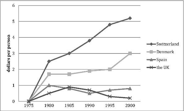
The line graph compares how much these four countries spent on the research of renewable energy during the period from 1975 to 2000.
In 1975, there were no countries budgeting for this research, while the spending from Switzerland, Denmark, Spain and the UK reached 2.6, 1.8, 1 and 0.5 dollars per person respectively in the year 1980.
In the 登录查看全部内容
参考题目2
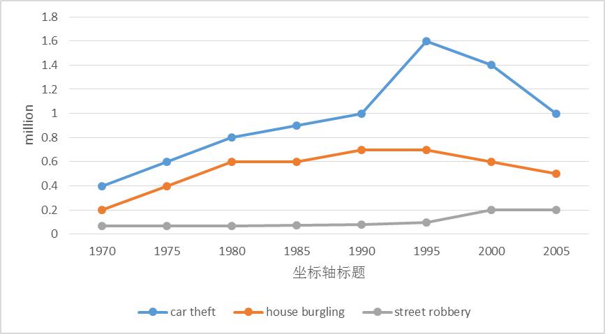
The line graph shows three different crimes in England and Wales in 1970-2005.
The line graph compares the number of three different kinds of crimes in England and Wales during the period from 1970 to 2005.
In 1970,the number of car theft was the highest (0.4 million), which was twice the figure for house burgling and nearly eight times the figure for street robbery. Then it increased quickly and reached 登录查看全部内容
参考题目3
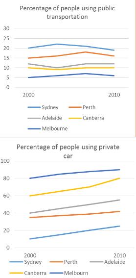
The line graphs show the percentage of people using public transport and people using private cars in five cities of Australia fro...
The line graphs show the percentage of people using public transport and people using private cars in five cities of Australia from 2000 to 2010.
The line graphs illustrate the changes of the percentage of the citizens using public transportation and using private cars in five different cities in Australia from 2000 to 2010.
The percentage of those who use public transportation fluctuated in all cities during these ten years, among which the proportion of Sydney occupies the leading place. The second 登录查看全部内容
题型2话题分类:柱状图属性:1级重点
参考题目1
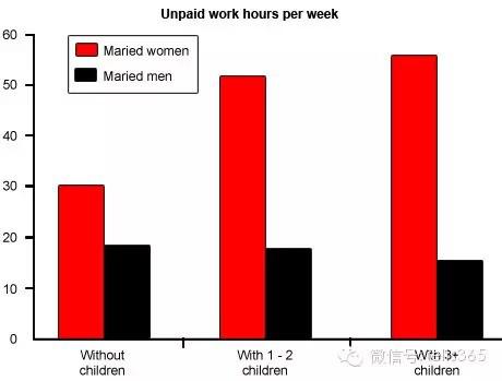
The diagram below shows the average hours of unpaid work per week done by people in different categories. (Unpaid work refers to s...
The diagram below shows the average hours of unpaid work per week done by people in different categories. (Unpaid work refers to such activities as childcare in the home, housework and gardening.)
Describe the information presented below, comparing results for men and women in the categories shown. Suggest reasons for what you see.
You should write at least 150 words.
You should spend about 20 minutes on this task.
The diagram reveals that the number of hours per week spent in unpaid work is unequally distributed between men and women.
In households where there are no children, women are reported to work some 30 hours per week in such tasks as housework and gardening. Men's contribution to these unpaid jobs averages a considerably lower 18 hours.
When children enter the househol 登录查看全部内容
参考题目2
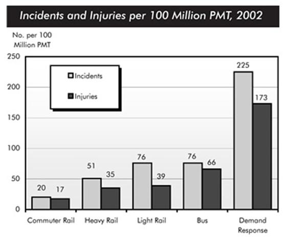
The chart below shows numbers of incidents and injuries per 100 million passenger miles travelled (PMT) by transportation type in ...
The chart below shows numbers of incidents and injuries per 100 million passenger miles travelled (PMT) by transportation type in 2002.
The bar chart compares the number of incidents and injuries for every 100 million passenger miles travelled on five different types of public transport in 2002.
It is clear that the most incidents and injuries took place on demand-response vehicles. By contrast, commuter rail services recorded by far the lowest figures.
A total of 225 in 登录查看全部内容
参考题目3
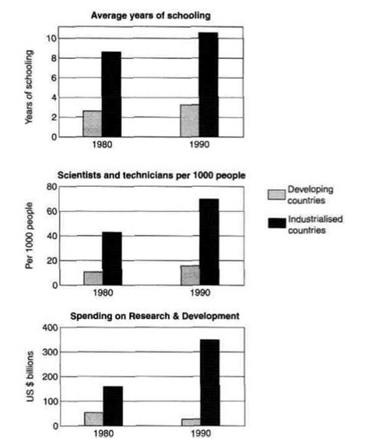
The charts below show the levels of participation in education and science in developing and industrialised countries in 1980 and ...
The charts below show the levels of participation in education and science in developing and industrialised countries in 1980 and 1990.
The three bar charts show average years of schooling, numbers of scientists and technicians, and research and development spending in developing and developed countries. Figures are given for 1980 and 1990.
It is clear from the charts that the figures for developed countries are much higher than those for developing nations. Also, the charts show an overall increase in 登录查看全部内容
题型3话题分类:饼状图属性:2级重点
参考题目1
Write a report for a university lecturer describing the information below.
You should write at least 150 words.
You should spend a...
Write a report for a university lecturer describing the information below.
You should write at least 150 words.
You should spend about 20 minutes on this task.
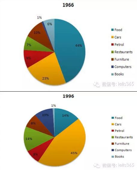
The pie charts show changes in American spending patterns between 1966 and 1996.
Food and cars made up the two biggest items of expenditure in both years. Together they comprised over half of household spending. Food accounted for 44% of spending in 1966, but this dropped by two thirds to 14% in 1996. However, 登录查看全部内容
参考题目2
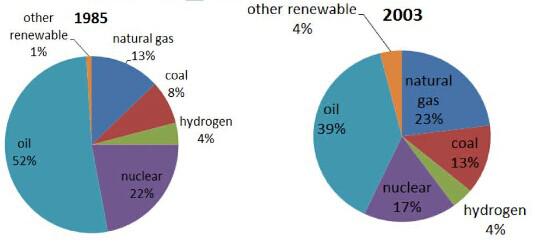
The pie charts show the proportion of the energy produced from different sources in a country between 1985 and 2003.
The pie charts present the change of the percentage of the energy produced from various sources in a particular country from 1985 to 2003.
It is clear that oil was the most dominant sources from which the energy was produced throughout the whole period, although it dropped from 52% in 1985 to 39%. Likewise, nuclear also declined, but much less significa 登录查看全部内容
参考题目3
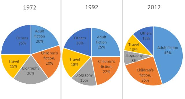
The pie charts below show the percentage of five kinds of books sold by a bookseller between 1972 and 2012.
The three pie charts compare the popularity of five different kinds of books according to the sales of a bookseller during the period from 1972 to 2012.
In 1972, the percentages of adult fiction and children’s fiction equaled, which were 20%, and then the figures experienced a gradual increase of 5 登录查看全部内容
题型4话题分类:混合图属性:2级重点
参考题目1
You should spend about 20 minutes on this task.
The graph and table below give information about water use worldwide and water con...
You should spend about 20 minutes on this task.
The graph and table below give information about water use worldwide and water consumption in two different countries.
Summarise the information by selecting and reporting the main features, and make comparisons where relevant.
The graph shows how the amount of water used worldwide changed between 1900 and 2000.
Throughout the century, the largest quantity of water was used for agricultural Purposes, and this increased dramatically from about 500 km3 to around 3,000 km3 in the year 2000. Water used in the industrial and domestic sectors also increased, but consumption was min 登录查看全部内容
参考题目2
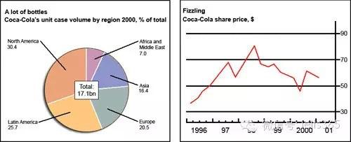
The chart and graph below give information about sales and share prices for Coca-Cola.
Write a report for a university lecturer de...
The chart and graph below give information about sales and share prices for Coca-Cola.
Write a report for a university lecturer describing the information shown below.
You should write at least 150 words.
You should spend about 20 minutes on this task.
The pie chart shows the worldwide distribution of sales of Coca-Cola in the year 2000 and the graph shows the change in share prices between 1996 and 2001.
In the year 2000, Coca-Cola sold a total of 17.1 billion cases of their fizzy drink product worldwide. The largest consumer was North America, where 30.4 per 登录查看全部内容


 沪公网安备31010702009436号