The two graphs show the main sources of energy in the USA in the 1980s and the 1990s.
Write a report for a university lecturer des...
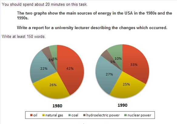
The two graphs show the main sources of energy in the USA in the 1980s and the 1990s.
Write a report for a university lecturer describing the changes which occurred.
The two graphs show that oil was the major energy source in the USA in both 1980 and 1990 and that coal, natural gas and hydroelectric power remained in much the same proportions. On the other hand, there was a dramatic rise in nuclear power, which doubled its percentage over the ten y 登录查看全部内容
参考题目2
You should spend about 20 minutes on this task.
Write a report for a university lecturer describing the information shown below.
Y...
You should spend about 20 minutes on this task.
Write a report for a university lecturer describing the information shown below.
You should write at least 150 words.
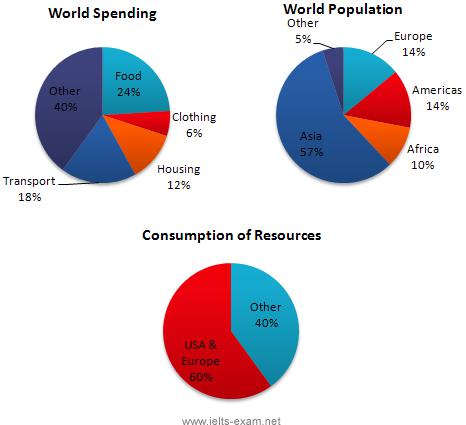
In this analysis we will examine three pie charts. The first one is headed ‘World Spending.’ The second is ‘World Population’ and the third is ‘Consumption of Resources.’
In the first chart we can see that people spend most of their income (24%) on food. In some countries this percentage would obviously be much higher. Transport and th 登录查看全部内容
参考题目3
Write a report for a university lecturer describing the information in the two graphs below.
You should write at least 150 words.
...
Write a report for a university lecturer describing the information in the two graphs below.
You should write at least 150 words.
Allow yourself 20 minutes for this task.
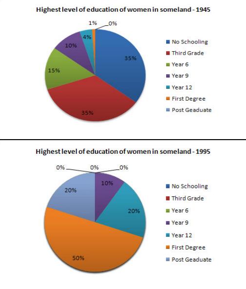
The pie charts compare the highest level of education achieved by women in Someland across two years, 1945 and 1995. It can be clearly seen that women received a much higher level of education in Someland in 1995 than they did in 1945.
In 1945 only 30% of women completed their secondary education and 1% went on to a first degree. No women had 登录查看全部内容
题型2话题分类:混合图属性:一级重点
参考题目1
You should spend about 20 minutes on this task.
The graph and table below give information about water use worldwide and water con...
You should spend about 20 minutes on this task.
The graph and table below give information about water use worldwide and water consumption in two different countries.
Summarise the information by selecting and reporting the main features, and make comparisons where relevant.
The graph shows how the amount of water used worldwide changed between 1900 and 2000.
Throughout the century, the largest quantity of water was used for agricultural Purposes, and this increased dramatically from about 500 km3 to around 3,000 km3 in the year 2000. Water used in the industrial and domestic sectors also increased, but consumption was min 登录查看全部内容
参考题目2
The chart and graph below give information about sales and share prices for Coca-Cola.
Write a report for a university lecturer de...
The chart and graph below give information about sales and share prices for Coca-Cola.
Write a report for a university lecturer describing the information shown below.
You should write at least 150 words.
You should spend about 20 minutes on this task.
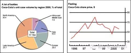
The pie chart shows the worldwide distribution of sales of Coca-Cola in the year 2000 and the graph shows the change in share prices between 1996 and 2001.
In the year 2000, Coca-Cola sold a total of 17.1 billion cases of their fizzy drink product worldwide. The largest consumer was North America, where 30.4 per 登录查看全部内容
参考题目3
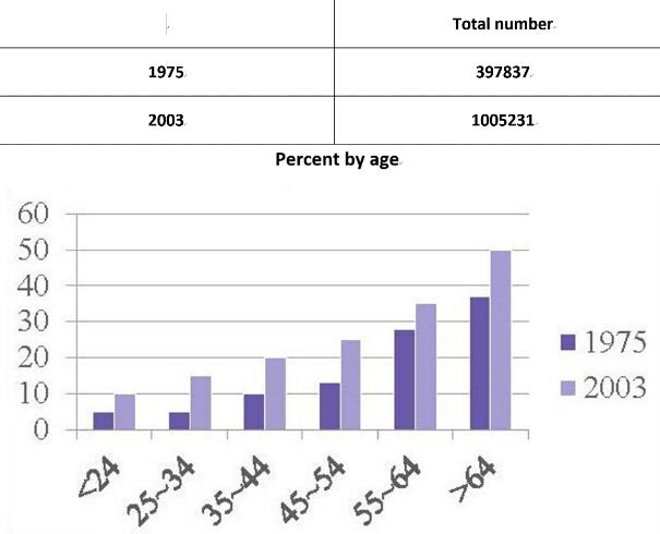
The following chart and table give information of UK cruise passengers in 1975 and 2003.
These two charts reveal the total cruise passenger number and the percentage of two different years among different age groups in UK.
The figures for the UK cruise passengers in 1975 showed an upward trend in all age groups. In the former three age groups, the percentages were all below 10%. And then it increased by 10-20% every decade, reaching 35% among those 登录查看全部内容
题型3话题分类:表格属性:一级重点
参考题目1
You should spend about 20 minutes on this task.
The table below give information about Favorite Pastimes in different countries.
S...
You should spend about 20 minutes on this task.
The table below give information about Favorite Pastimes in different countries.
Summarise the information by selecting and reporting the main features, and make comparisons where relevant.
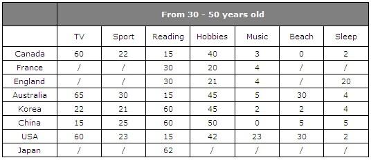
This table clearly presents and compares favorable pastimes in eight different countries. The pastimes, across the top of the table, are analyzed in relation to each country.
As can be seen, about 60% of Canadians, Australians and Americans like watching television. On the other hand, this figure is quite low for China where only 15% of people watch tel 登录查看全部内容
参考题目2
Write a report for a university lecturer describing the information in the two graphs below.
You should write at least 150 words.
...
Write a report for a university lecturer describing the information in the two graphs below.
You should write at least 150 words.
Allow yourself 20 minutes for this task.
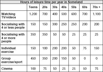
The table shows how people in different age groups spend their leisure time in Someland over the course of a year. It can be clearly seen that the amount of leisure time available varies considerably across the age groups and that people of different age levels have very different ways of spending their leisure time.
According to the figures, as people age in Someland their social lives reduce. Teenagers and people in their twenties spend on average 500 hours per year on socialising and 350 hours of that 登录查看全部内容
参考题目3
The table below shows social and economic indicators for four countries in 1994, according to United Nations statistics.
Describe ...
The table below shows social and economic indicators for four countries in 1994, according to United Nations statistics.
Describe the information shown below in your own words. What implications do the indicators have for the countries?
You should write at least 150 words.
Allow yourself 20 minutes for this task.
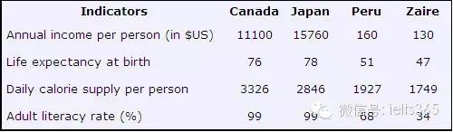
A glance at four indicators of economic and social conditions in four countries, Canada, Japan, Peru and Zaire, in 1994 reflects the great differences that exist between wealthier and poorer nations.
The table shows that Japan and Canada had annual incomes of $15,760 and $11,100 per person, respectively. These figures were overwhelmingly greater than the corresponding figures of $160 in Peru and $130 in Zaire.
Health indicators, too, reflected overall levels of affluence in th 登录查看全部内容
题型4话题分类:线状图属性:二级重点
参考题目1
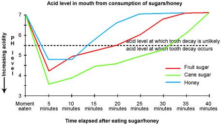
Eating sweet foods produces acid in the mouth, which can cause tooth decay. (High acid levels are measured by low pH values)
Descr...
Eating sweet foods produces acid in the mouth, which can cause tooth decay. (High acid levels are measured by low pH values)
Describe the information below and discuss the implications for dental health.
You should write at least 150 words.
Allow yourself 20 minutes for this task.
Anyone who has visited a dentist has been told that eating excessive amounts of sweets risks harming the teeth. This is because sweets lower pH levels in the mouth to dangerous levels.
When the pH level in the mouth is kept above 5.5, acidity is such that teeth are unlikely to be in danger of decay. Sweet foods, however, cause pH in the mouth to drop for a time, and the longer pH levels remain below 5.5, the greater the opportunity for decay to occur.
登录查看全部内容
参考题目2
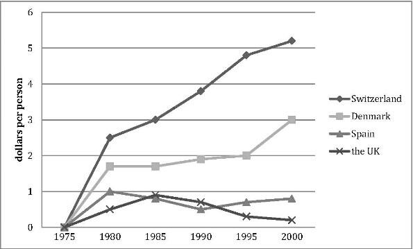
The graph shows the spending on research into renewable energy of four countries from 1975 to 2000.
The line graph compares how much these four countries spent on the research of renewable energy during the period from 1975 to 2000.
In 1975, there were no countries budgeting for this research, while the spending from Switzerland, Denmark, Spain and the UK reached 2.6, 1.8, 1 and 0.5 dollars per person respectively in the year 1980.
In the 登录查看全部内容
参考题目3
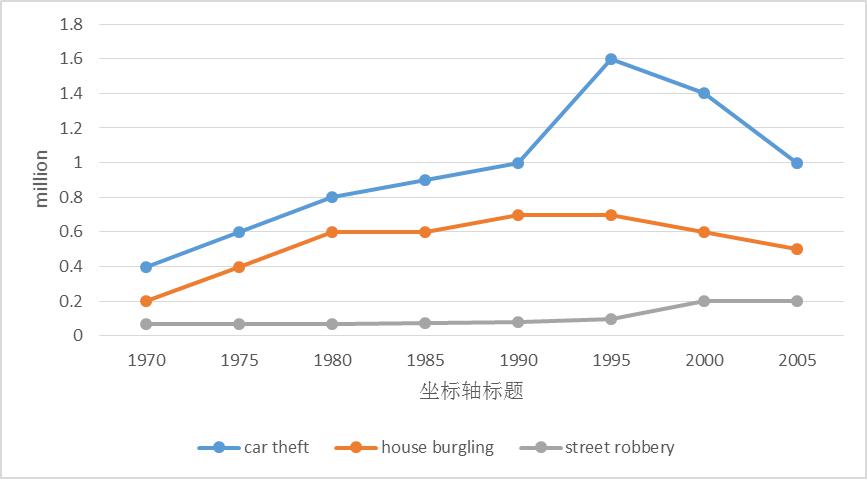
The line graph shows three different crimes in England and Wales in 1970-2005.
The line graph compares the number of three different kinds of crimes in England and Wales during the period from 1970 to 2005.
In 1970,the number of car theft was the highest (0.4 million), which was twice the figure for house burgling and nearly eight times the figure for street robbery. Then it increased quickly and reached 登录查看全部内容
题型5话题分类:柱状图属性:二级重点
参考题目1
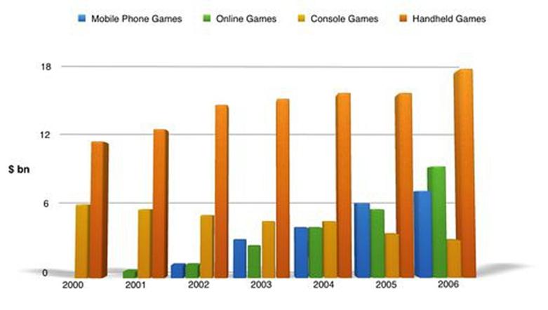
The bar graph shows the global sales (in billions of dollars) of different types of digital games between 2000 and 2006.
The bar chart compares the turnover in dollars from sales of video games for four different platforms, namely mobile phones, online, consoles and handheld devices, from 2000 to 2006.
It is clear that sales of games for three out of the four platforms rose each year, leading to a significant rise in total global turnover over the 7-year period. Sales figures 登录查看全部内容
参考题目2
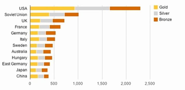
The chart below shows the total number of Olympic medals won by twelve different countries.
The bar chart compares twelve countries in terms of the overall number of medals that they have won at the Olympic Games.
It is clear that the USA is by far the most successful Olympic medal winning nation. It is also noticeable that the figures for gold, silver and bronze medals won by any particular country tend to be fairly simil 登录查看全部内容
参考题目3
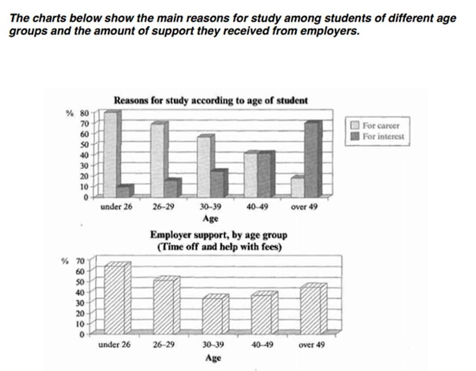
The charts below show the main reasons for study among students of different groups and the amount of support they received from e...
The charts below show the main reasons for study among students of different groups and the amount of support they received from employers.
The bar charts compare students of different ages in terms of why they are studying and whether they are supported by an employer.
It is clear that the proportion of students who study for career purposes is far higher among the younger age groups, while the oldest students are more likely to study for interest. Employer support is more 登录查看全部内容


 沪公网安备31010702009436号