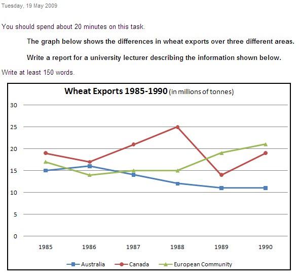
The graph below shows the differences in wheat exports over three different areas. Write a report for a university lecturer descri...
The graph below shows the differences in wheat exports over three different areas. Write a report for a university lecturer describing the information shown below.
The three graphs of wheat exports each show a quite different pattern between 1985 and 1990. Exports from Australia declined over the five-year period, while the Canadian market fluctuated considerably, and the European Community showed an increase.
In 1985, Australia exported about 15 millions of tonnes of wheat and the 登录查看全部内容
参考题目2
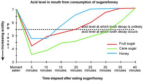
Eating sweet foods produces acid in the mouth, which can cause tooth decay. (High acid levels are measured by low pH values)
Descr...
Eating sweet foods produces acid in the mouth, which can cause tooth decay. (High acid levels are measured by low pH values)
Describe the information below and discuss the implications for dental health.
You should write at least 150 words.
Allow yourself 20 minutes for this task.
Anyone who has visited a dentist has been told that eating excessive amounts of sweets risks harming the teeth. This is because sweets lower pH levels in the mouth to dangerous levels.
When the pH level in the mouth is kept above 5.5, acidity is such that teeth are unlikely to be in danger of decay. Sweet foods, however, cause pH in the mouth to drop for a time, and the longer pH levels remain below 5.5, the greater the opportunity for decay to occur.
登录查看全部内容
参考题目3
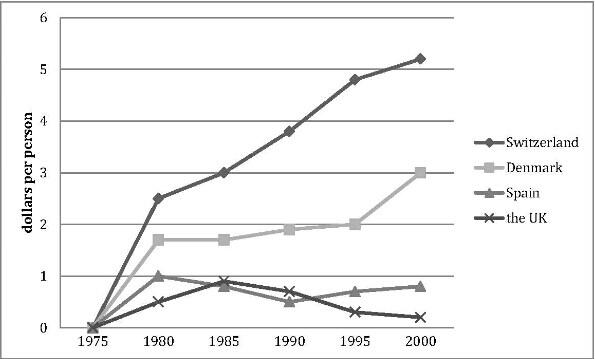
The graph shows the spending on research into renewable energy of four countries from 1975 to 2000.
The line graph compares how much these four countries spent on the research of renewable energy during the period from 1975 to 2000.
In 1975, there were no countries budgeting for this research, while the spending from Switzerland, Denmark, Spain and the UK reached 2.6, 1.8, 1 and 0.5 dollars per person respectively in the year 1980.
In the 登录查看全部内容
参考题目4
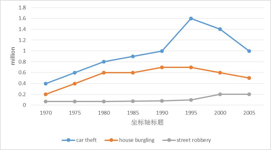
The line graph shows three different crimes in England and Wales in 1970-2005.
The line graph compares the number of three different kinds of crimes in England and Wales during the period from 1970 to 2005.
In 1970,the number of car theft was the highest (0.4 million), which was twice the figure for house burgling and nearly eight times the figure for street robbery. Then it increased quickly and reached 登录查看全部内容
参考题目5
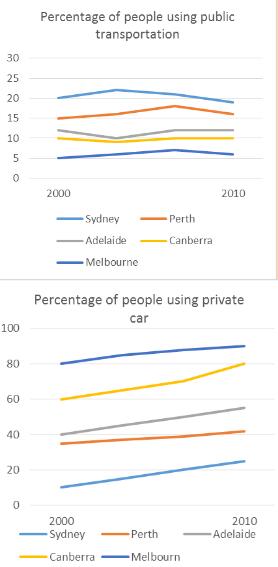
The line graphs show the percentage of people using public transport and people using private cars in five cities of Australia fro...
The line graphs show the percentage of people using public transport and people using private cars in five cities of Australia from 2000 to 2010.
The line graphs illustrate the changes of the percentage of the citizens using public transportation and using private cars in five different cities in Australia from 2000 to 2010.
The percentage of those who use public transportation fluctuated in all cities during these ten years, among which the proportion of Sydney occupies the leading place. The second 登录查看全部内容
参考题目6
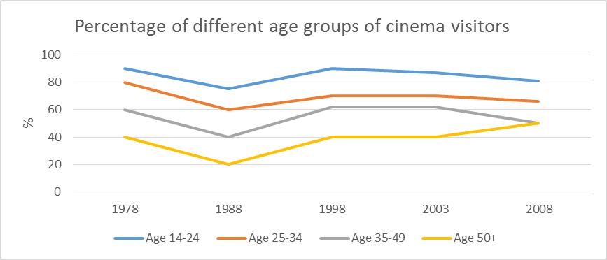
The line graph shows the percentage of different age groups of cinema visitors in a particular country.
The line graph reveals the proportion of people who go to the movies by four age groups in a particular nation from 1978 to 2008.
During the thirty years, three age groups (14-24, 25-34 and 35-49) experienced a similar pattern. The young (age 14-24) enjoyed visiting cinema the most, reaching 90% in 1978, and then it declined slightly to 75% in 1988 and grew up again 登录查看全部内容
参考题目7
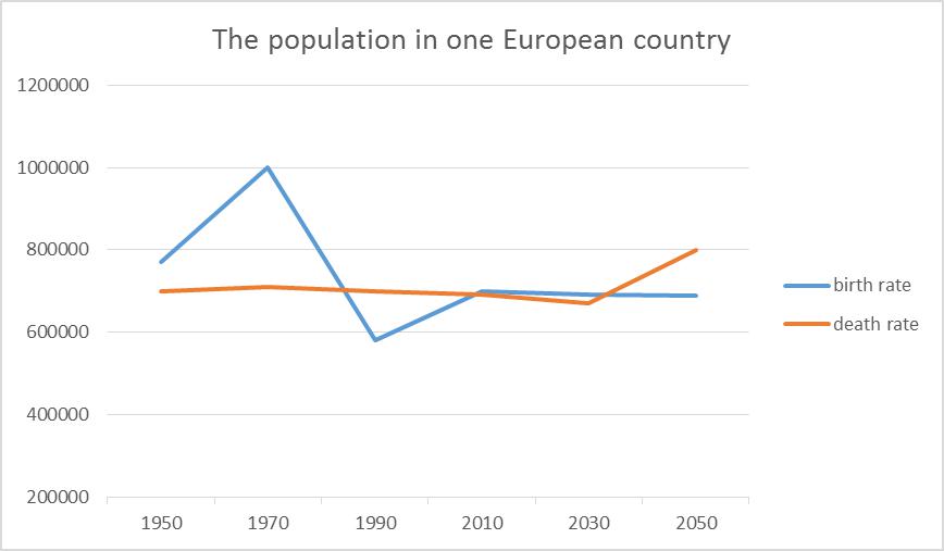
The line graph shows the population in one European country.
The line graph reveals both the birth rate and death rate in a European country during the year of 1950 to 2050.
In 1950, the total number of people in this country was approximately 780,000, and after that it soared to nearly 1,000,000. However, after the peak in 1970, th 登录查看全部内容
参考题目8
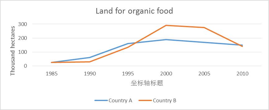
The line below shows the land used for organic crops in two countries between 1985 to 2010.
The line gives us information about the area of land used for organic crops in country A and country B during the period of 1985 to 2010.
In 1985, the area of land for organic crops of the two country were the same (25 thousand hectares). In the next five years, the figures in both countries experienced a slight rise, 登录查看全部内容
参考题目9
The line graph compares average yearly spending by Americans on mobile and landline phone services from 2001 to 2010.
The line graph compares average yearly spending by Americans on mobile and landline phone services from 2001 to 2010.
It is clear that spending on landline phones fell steadily over the 10-year period, while mobile phone expenditure rose quickly. The year 2006 marks the point at which expenditure on mobile service 登录查看全部内容
参考题目10
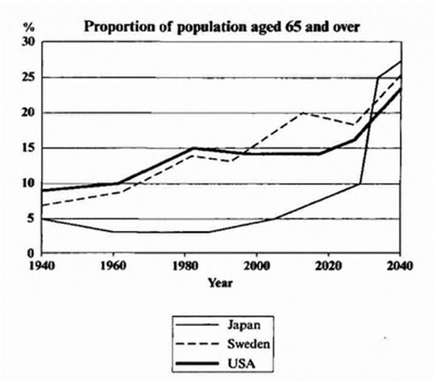
The graph below shows the proportion of the population aged 65 and over between 1940 and 2040 in three different countries.
The line graph compares the percentage of people aged 65 or more in three countries over a period of 100 years.
It is clear that the proportion of elderly people increases in each country between 1940 and 2040. Japan is expected to see the most dramatic changes in its elderly population.
In 1940, around 9% of Americans 登录查看全部内容
参考题目11
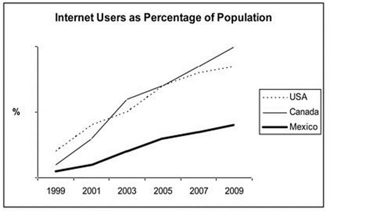
The line graph compares the percentage of people in three countries who used the Internet between 1999 and 2009.
The line graph compares the percentage of people in three countries who used the Internet between 1999 and 2009.
It is clear that the proportion of the population who used the Internet increased in each country over the period shown. Overall, a much larger percentage of Canadians and Americ 登录查看全部内容
题型2话题分类:饼状图属性:大范围重点预测
参考题目1
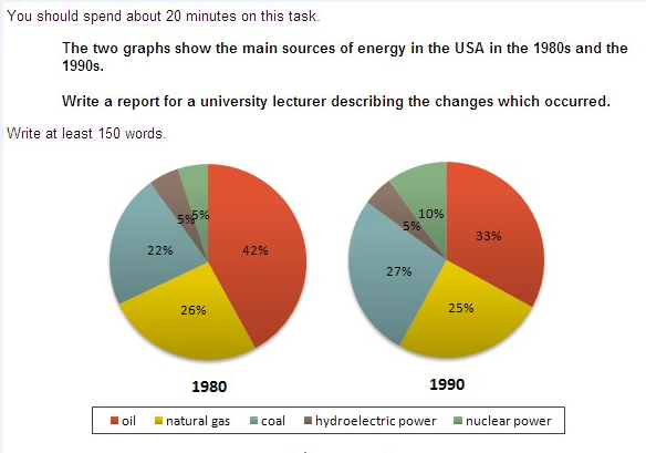
The two graphs show the main sources of energy in the USA in the 1980s and the 1990s.
Write a report for a university lecturer des...
The two graphs show the main sources of energy in the USA in the 1980s and the 1990s.
Write a report for a university lecturer describing the changes which occurred.
The two graphs show that oil was the major energy source in the USA in both 1980 and 1990 and that coal, natural gas and hydroelectric power remained in much the same proportions. On the other hand, there was a dramatic rise in nuclear power, which doubled its percentage over the ten y 登录查看全部内容
参考题目2
You should spend about 20 minutes on this task.
Write a report for a university lecturer describing the information shown below.
Y...
You should spend about 20 minutes on this task.
Write a report for a university lecturer describing the information shown below.
You should write at least 150 words.
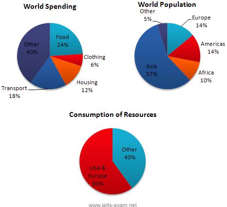
In this analysis we will examine three pie charts. The first one is headed ‘World Spending.’ The second is ‘World Population’ and the third is ‘Consumption of Resources.’
In the first chart we can see that people spend most of their income (24%) on food. In some countries this percentage would obviously be much higher. Transport and th 登录查看全部内容
参考题目3
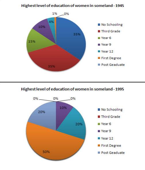
Write a report for a university lecturer describing the information in the two graphs below.
You should write at least 150 words.
...
Write a report for a university lecturer describing the information in the two graphs below.
You should write at least 150 words.
Allow yourself 20 minutes for this task.
The pie charts compare the highest level of education achieved by women in Someland across two years, 1945 and 1995. It can be clearly seen that women received a much higher level of education in Someland in 1995 than they did in 1945.
In 1945 only 30% of women completed their secondary education and 1% went on to a first degree. No women had 登录查看全部内容
参考题目4
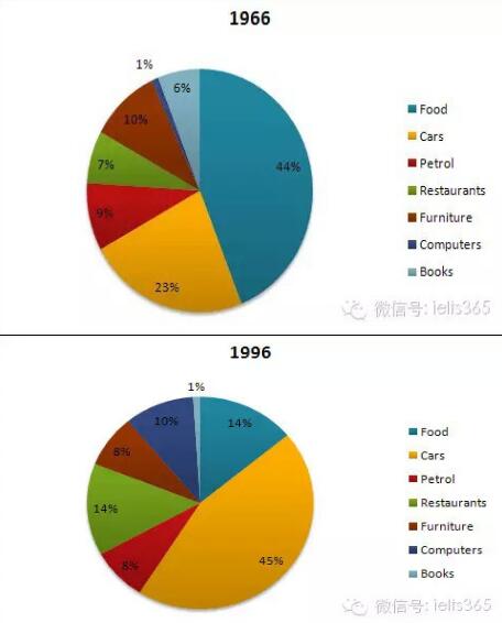
Write a report for a university lecturer describing the information below.
You should write at least 150 words.
You should spend a...
Write a report for a university lecturer describing the information below.
You should write at least 150 words.
You should spend about 20 minutes on this task.
The pie charts show changes in American spending patterns between 1966 and 1996.
Food and cars made up the two biggest items of expenditure in both years. Together they comprised over half of household spending. Food accounted for 44% of spending in 1966, but this dropped by two thirds to 14% in 1996. However, 登录查看全部内容
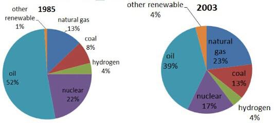
参考题目5
The pie charts show the proportion of the energy produced from different sources in a country between 1985 and 2003.
The pie charts present the change of the percentage of the energy produced from various sources in a particular country from 1985 to 2003.
It is clear that oil was the most dominant sources from which the energy was produced throughout the whole period, although it dropped from 52% in 1985 to 39%. Likewise, nuclear also declined, but much less significa 登录查看全部内容
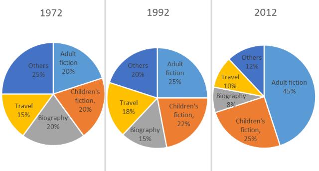
参考题目6
The pie charts below show the percentage of five kinds of books sold by a bookseller between 1972 and 2012.
The three pie charts compare the popularity of five different kinds of books according to the sales of a bookseller during the period from 1972 to 2012.
In 1972, the percentages of adult fiction and children’s fiction equaled, which were 20%, and then the figures experienced a gradual increase of 5 登录查看全部内容
参考题目7
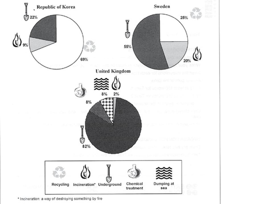
The pie charts below show how dangerous waste products are dealt with in three countries.
The charts compare Korea, Sweden and the UK in terms of the methods used in each country to dispose of harmful waste.
It is clear that in both the UK and Sweden, the majority of dangerous waste products are buried underground. By contrast, most hazardous materials in the Republic of Korea are recy 登录查看全部内容
题型3话题分类:地图属性:大范围重点预测
参考题目1
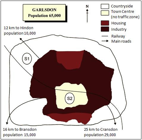
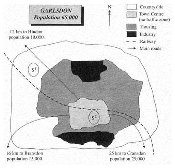
The map below is of the town of Garlsdon. A new supermarket (S) is planned for the town. The map shows two possible sites for the ...
The map below is of the town of Garlsdon. A new supermarket (S) is planned for the town. The map shows two possible sites for the supermarket.
Summarise the information by selecting and reporting the main features, and make comparisons where relevant.
You should write at least 150 words.
Allow yourself 20 minutes for this task.
The first potential location (S1) is outside the town itself, and is sited just off the main road to the town of Hindon, lying 12 kms to the north-west. This site is in the countryside and so would be able to accommodate a lot of car parking. This would make it accessible to shoppers from both Hindon and Garlsdon who could travel by 登录查看全部内容
参考题目2
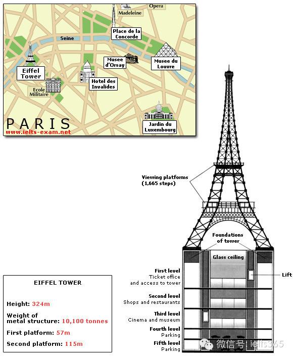
The diagrams below give information about the Eiffel Tower in Paris and an outline project to extend it underground.
Write a repor...
The diagrams below give information about the Eiffel Tower in Paris and an outline project to extend it underground.
Write a report for a university lecturer describing the information shown.
You should write at least 150 words.
You should spend about 20 minutes on this task.
The Eiffel Tower is situated close to the Seine River in Paris. It is a metal structure that is 1,063 feet high and weighs 7,417 tonnes. The tower has been a tourist attraction since 1889, when it was built, and there are 1,665 steps that can be climbed in order to reach the two viewing platforms.
There a 登录查看全部内容
参考题目3
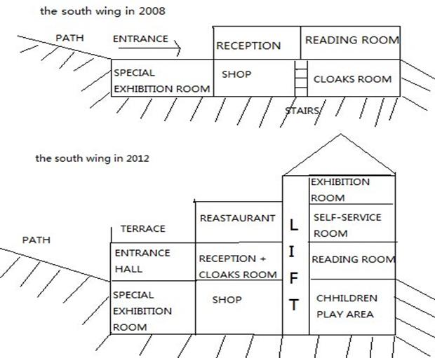
The plans below show the South Wing of Walton Museum in 2008 and in 2012 after it was redeveloped.
The maps reveal the change of the South Wing of Walton Museum in the period of 2008 to 2012.
In 2008, the South Wing was a two-storey building with a path on the west. On the ground floor, there was a special exhibition room, a shop and a cloaks room. The reception was on the first floor, and there was also a reading ro 登录查看全部内容
参考题目4
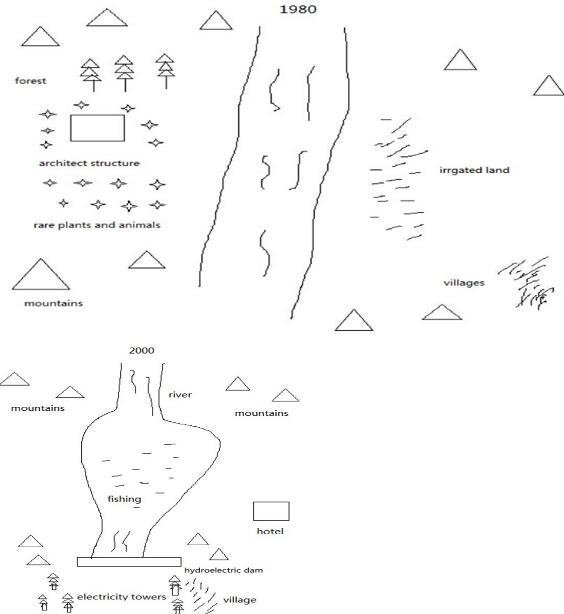
The maps show the change of a place in 1980 and in 2000.
The two maps reveal the change of a place, before and after the construction of hydroelectric dam.
In 1980, there was a river flowing from north to south among mountains. On the right bank of the river, the irrigated land was scattered along the river, with villages on its right side. On the left side of the river, there was a forest, whic 登录查看全部内容
参考题目5
The diagrams below show how houses can be protected in areas which are prone to flooding.
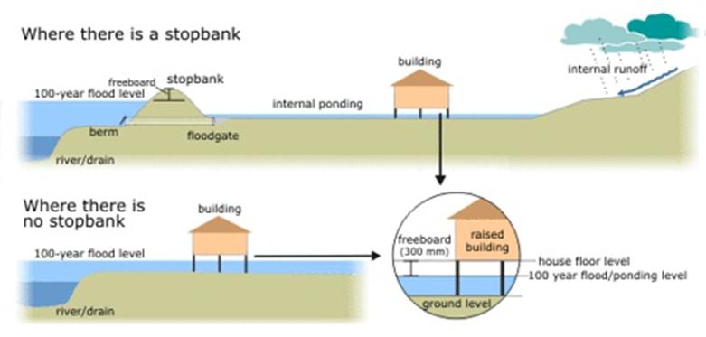
The diagrams compare two different methods of defence for homes which are at risk of being flooded.
The key difference between the diagrams is that they show flood protection with and without a stopbank. In either case, the at-risk home is raised on stilts above ground level.
The first diagram shows how a stopbank acts as a flood barrier 登录查看全部内容
参考题目6
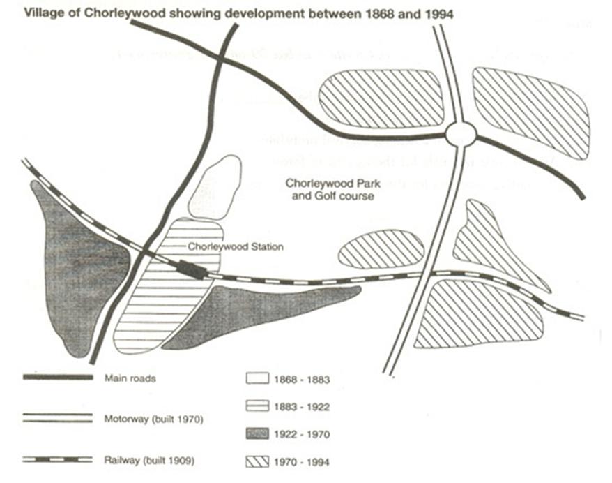
The map shows the development of the village of Chorleywood between 1868 and 1994.
The map shows the growth of a village called Chorleywood between 1868 and 1994.
It is clear that the village grew as the transport infrastructure was improved. Four periods of development are shown on the map, and each of the populated areas is near to the main roads, the railway or the motorway.
From 1868 to 1883, Ch 登录查看全部内容
参考题目7
The map below is of the town of Garlsdon. A new supermarket (S) is planned for the town. The map shows two possible sites for the ...
The map below is of the town of Garlsdon. A new supermarket (S) is planned for the town. The map shows two possible sites for the supermarket.
The map shows two potential locations (S1 and S2) for a new supermarket in a town called Garlsdon.
The main difference between the two sites is that S1 is outside the town, whereas S2 is in the town centre. The sites can also be compared in terms of access by road or rail, and their positions relative t 登录查看全部内容
参考题目8
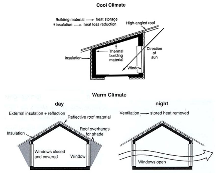
The diagrams below show some principles of house design for cool and for warm climates.
The diagrams show how house designs differ according to climate.
The most noticeable difference between houses designed for cool and warm climates is in the shape of the roof. The designs also differ with regard to the windows and the use of insulation.
We can see that the cool climate house has a high-a 登录查看全部内容
题型4话题分类:表格属性:大范围重点预测
参考题目1
You should spend about 20 minutes on this task.
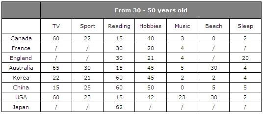
The table below give information about Favorite Pastimes in different countries.
S...
You should spend about 20 minutes on this task.
The table below give information about Favorite Pastimes in different countries.
Summarise the information by selecting and reporting the main features, and make comparisons where relevant.
This table clearly presents and compares favorable pastimes in eight different countries. The pastimes, across the top of the table, are analyzed in relation to each country.
As can be seen, about 60% of Canadians, Australians and Americans like watching television. On the other hand, this figure is quite low for China where only 15% of people watch tel 登录查看全部内容
参考题目2
Write a report for a university lecturer describing the information in the two graphs below.
You should write at least 150 words.
...
Write a report for a university lecturer describing the information in the two graphs below.
You should write at least 150 words.
Allow yourself 20 minutes for this task.
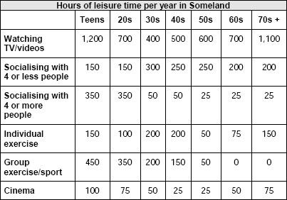
The table shows how people in different age groups spend their leisure time in Someland over the course of a year. It can be clearly seen that the amount of leisure time available varies considerably across the age groups and that people of different age levels have very different ways of spending their leisure time.
According to the figures, as people age in Someland their social lives reduce. Teenagers and people in their twenties spend on average 500 hours per year on socialising and 350 hours of that 登录查看全部内容
参考题目3
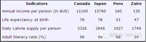
The table below shows social and economic indicators for four countries in 1994, according to United Nations statistics.
Describe ...
The table below shows social and economic indicators for four countries in 1994, according to United Nations statistics.
Describe the information shown below in your own words. What implications do the indicators have for the countries?
You should write at least 150 words.
Allow yourself 20 minutes for this task.
A glance at four indicators of economic and social conditions in four countries, Canada, Japan, Peru and Zaire, in 1994 reflects the great differences that exist between wealthier and poorer nations.
The table shows that Japan and Canada had annual incomes of $15,760 and $11,100 per person, respectively. These figures were overwhelmingly greater than the corresponding figures of $160 in Peru and $130 in Zaire.
Health indicators, too, reflected overall levels of affluence in th 登录查看全部内容
参考题目4
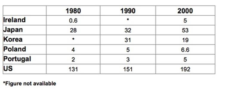
The table below shows the amount of waste production (in millions of tonnes) in six different countries over a twenty-year period.
The chart compares the amounts of waste that were produced in six countries in the years 1980, 1990 and 2000.
In each of these years, the US produced more waste than Ireland, Japan, Korea, Poland and Portugal combined. It is also noticeable that Korea was the only country that managed to reduce its waste output b 登录查看全部内容
参考题目5
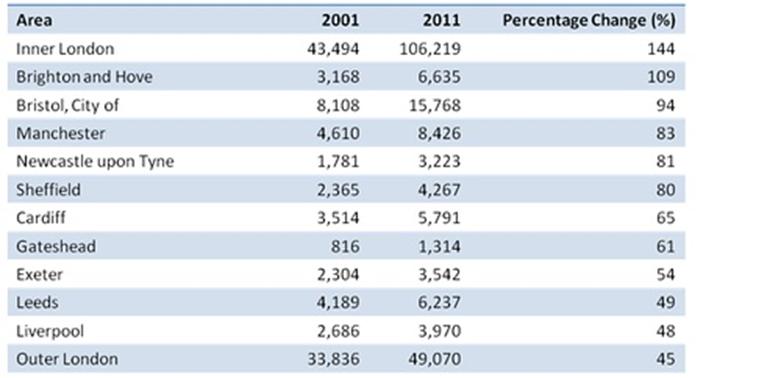
The table below shows changes in the numbers of residents cycling to work in different areas of the UK between 2001 and 2011.
The table compares the numbers of people who cycled to work in twelve areas of the UK in the years 2001 and 2011.
Overall, the number of UK commuters who travelled to work by bicycle rose considerably over the 10-year period. Inner London had by far the highest number of cycling commuters in both years.
In 2001, w 登录查看全部内容
参考题目6
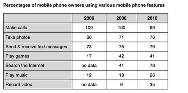
The table compares the percentages of people using different functions of their mobile phones between 2006 and 2010.
The table compares the percentages of people using different functions of their mobile phones between 2006 and 2010.
Throughout the period shown, the main reason why people used their mobile phones was to make calls. However, there was a marked increase in the popularity of other mobile phone features, particularly the Internet search feature.
登录查看全部内容
参考题目7
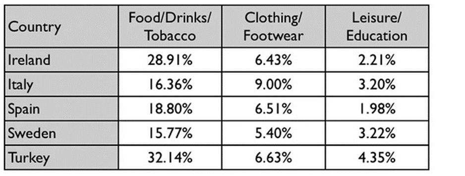
The table below gives information on consumer spending on different items in five different countries in 2002.
Percentage of natio...
The table below gives information on consumer spending on different items in five different countries in 2002.
Percentage of national consumer expenditure by category - 2002
The table shows percentages of consumer expenditure for three categories of products and services in five countries in 2002.
It is clear that the largest proportion of consumer spending in each country went on food, drinks and tobacco. On the other hand, the leisure/education category has the lowest percentages in the tabl 登录查看全部内容
参考题目8
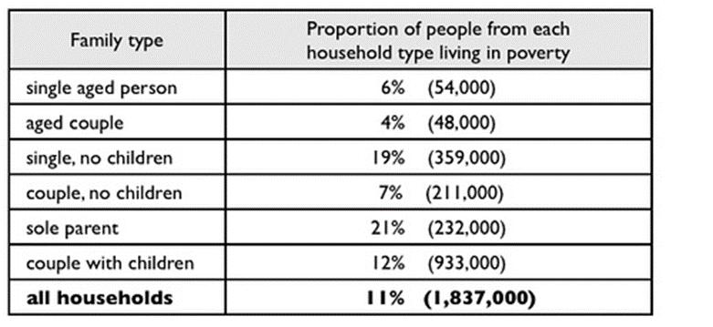
The table below shows the proportion of different categories of families living in poverty in Australia in 1999.
The table gives information about poverty rates among six types of household in Australia in the year 1999.
It is noticeable that levels of poverty were higher for single people than for couples, and people with children were more likely to be poor than those without. Poverty rates we 登录查看全部内容
参考题目9
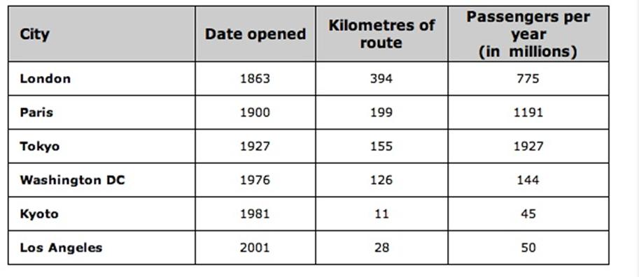
The table below gives information about the underground railway systems in six cities.
The table shows data about the underground rail networks in six major cities.
The table compares the six networks in terms of their age, size and the number of people who use them each year. It is clear that the three oldest underground systems are larger and serve significantly more passengers than the newer systems.
The London underground is the oldes 登录查看全部内容
题型5话题分类:混合图属性:大范围重点预测
参考题目1
You should spend about 20 minutes on this task.
The graph and table below give information about water use worldwide and water con...
You should spend about 20 minutes on this task.
The graph and table below give information about water use worldwide and water consumption in two different countries.
Summarise the information by selecting and reporting the main features, and make comparisons where relevant.
The graph shows how the amount of water used worldwide changed between 1900 and 2000.
Throughout the century, the largest quantity of water was used for agricultural Purposes, and this increased dramatically from about 500 km3 to around 3,000 km3 in the year 2000. Water used in the industrial and domestic sectors also increased, but consumption was min 登录查看全部内容
参考题目2
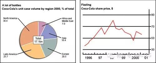
The chart and graph below give information about sales and share prices for Coca-Cola.
Write a report for a university lecturer de...
The chart and graph below give information about sales and share prices for Coca-Cola.
Write a report for a university lecturer describing the information shown below.
You should write at least 150 words.
You should spend about 20 minutes on this task.
The pie chart shows the worldwide distribution of sales of Coca-Cola in the year 2000 and the graph shows the change in share prices between 1996 and 2001.
In the year 2000, Coca-Cola sold a total of 17.1 billion cases of their fizzy drink product worldwide. The largest consumer was North America, where 30.4 per 登录查看全部内容
参考题目3
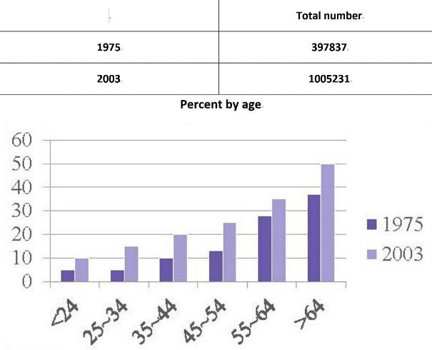
The following chart and table give information of UK cruise passengers in 1975 and 2003.
These two charts reveal the total cruise passenger number and the percentage of two different years among different age groups in UK.
The figures for the UK cruise passengers in 1975 showed an upward trend in all age groups. In the former three age groups, the percentages were all below 10%. And then it increased by 10-20% every decade, reaching 35% among those 登录查看全部内容
参考题目4
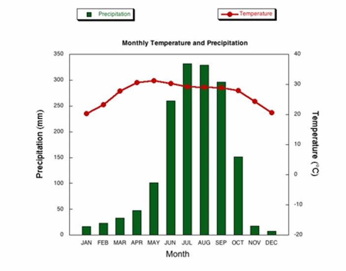
The climograph below shows average monthly temperatures and rainfall in the city of Kolkata.
The chart compares average figures for temperature and precipitation over the course of a calendar year in Kolkata.
It is noticeable that monthly figures for precipitation in Kolkata vary considerably, whereas monthly temperatures remain relatively stable. Rainfall is highest from July to August, while temperatures are highest in Apri 登录查看全部内容
参考题目5
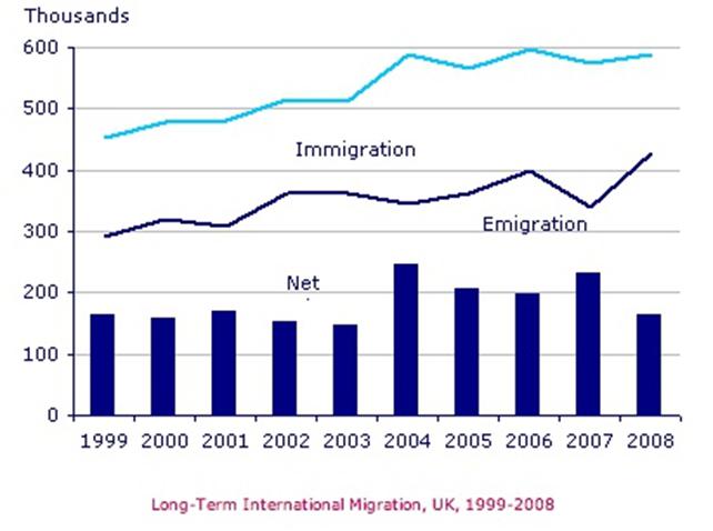
The chart gives information about UK immigration, emigration and net migration between 1999 and 2008.
The chart gives information about UK immigration, emigration and net migration between 1999 and 2008.
Both immigration and emigration rates rose over the period shown, but the figures for immigration were significantly higher. Net migration peaked in 2004 and 2007.
In 1999, over 450,000 people came to live in th 登录查看全部内容


 沪公网安备31010702009436号